Product request
You are looking for a solution:
Select an option, and we will develop the best offer
for you
Think Like a User
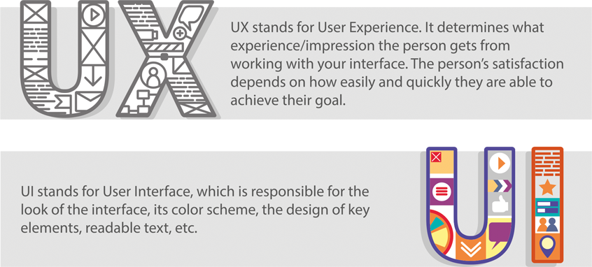
When you are working on an IPTV/OTT project, sooner or later the question about how the user interacts with your service will come up. Whether you gain a new satisfied customer or whether they will move on in their search for a more convenient resource depends on whether you have created a practical and intuitive interface. Sometimes this can be quite difficult since it can require a specialist who has a lot of experience in designing and visualization. At this stage, concepts such as UX and UI design come into play.
Why is this necessary?
The objective of UX design is the same for any business to solve the user’s question by successfully selling your product or service to them. In the digital era, the interface performs a function that is similar to what a sales consultant in a store or a sales manager in an office does. Based on personal experience of interaction with the interface of your site or service the user makes a decision — to be or not to be? To like it or not to like it. To buy or not buy. Just as carefully as we choose staff, we need to assess the appearance and capabilities of an internet service. You need to know which interface functions will attract the users, and which ones will prompt users to seek out the services of competitors. The success of your business largely depends on this. We prepared a selection of basic rules that allow you to evaluate the «professional qualities» of your virtual sales tool.
1. People Don’t Read, They Scan
This is the first rule that anyone who communicates with customers through the device screen should remember. When users visit your website or application, they will not read through all of your content as they make comparisons and decide on which action to take. They will click on the first thing that seems suitable to them.
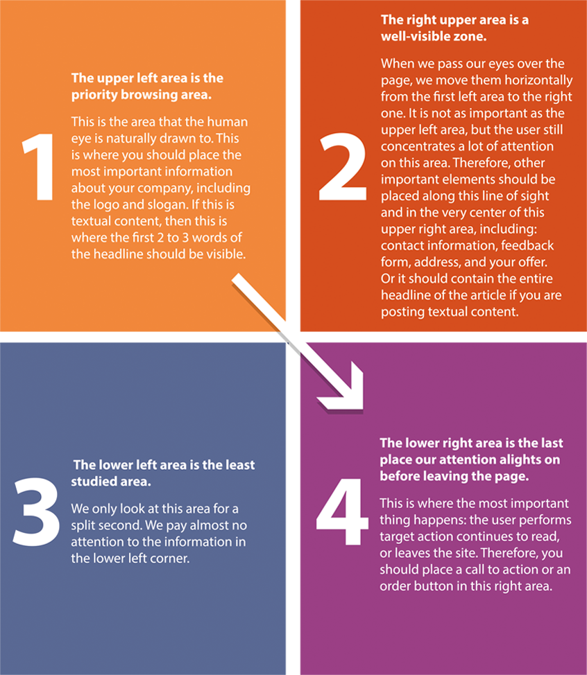
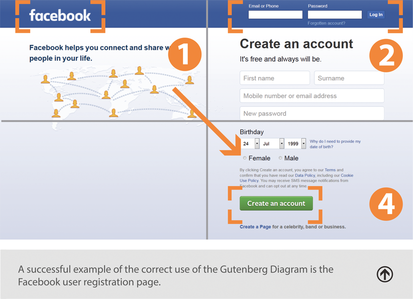
The Gutenberg Diagram
The Gutenberg Diagram schematically shows where users direct their attention when browsing content on any device, whether it is a smartphone, laptop or TV. When we look at a page, we divide it into 4 areas:
2. The KISS Principle
KISS is an acronym that can stand for several things. The most popular of them are "keep it simple, stupid" and "keep it short and simple". This principle is considered one of the key rules of UI/UX design. It emphasizes that the interface should be simple and intuitive, that the meaning of the elements should be obvious, and that the user should be able to achieve their goals with a minimum number of actions.
The application should help the user accomplish their objective. It is not the end in itself. If the navigation and structure of the site are not intuitive, this will cause users to have more questions and it will be more difficult for them to understand how the system works and how they can get from point A to point B. This will make them uncomfortable on a subconscious level, and they will want to leave your site.

3. Don’t Make the User Think
Do not require a lot from the user. The fewer the number of actions that need to be taken to try the service, the more likely it is that the visitor to your site will actually do it.
People who are exploring your site for the first time are not interested in filling out long forms to create an account that they may never need again. Give the potential client the opportunity to use the product without forcing them to provide a lot of personal information.


4. Fitts’s Law
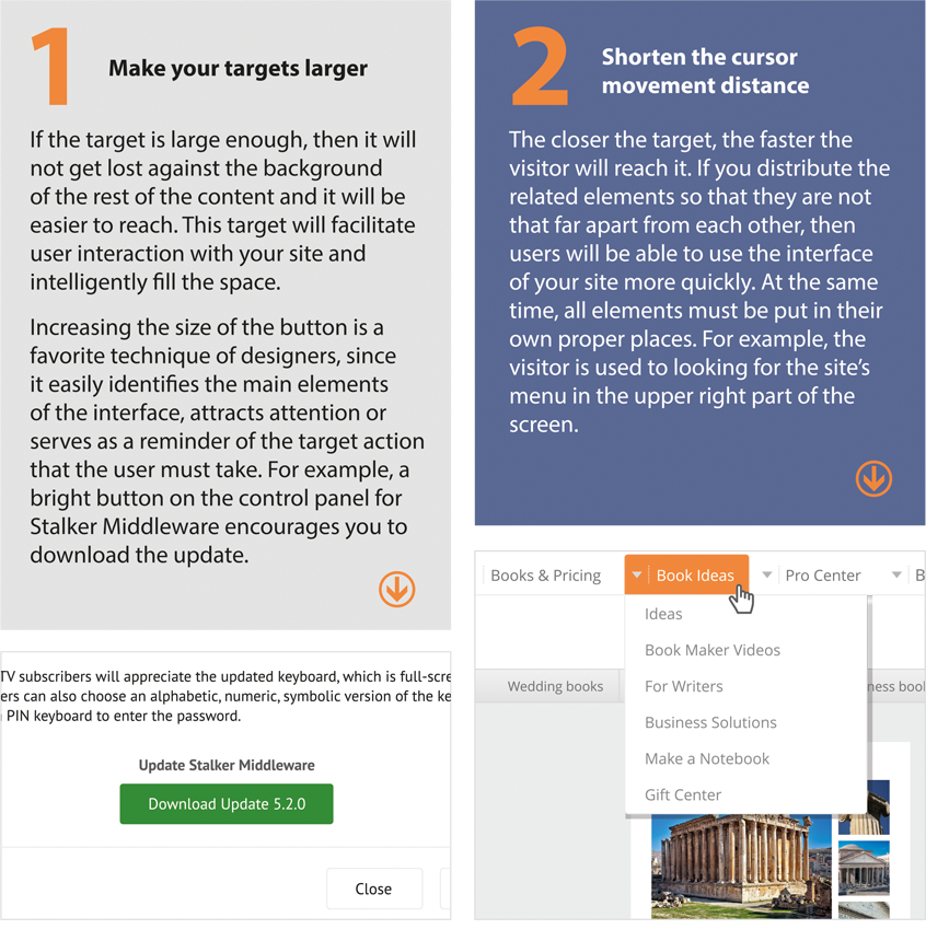
Fitts’s Law describes the relationship between the amount of time required to move to a target, the size of this target, and the distance to it. It goes like this: the easier it is to find a target and the shorter the distance to it, the faster and easier it will be to move to that target.
We can draw 2 conclusions from this law:
5. Hick’s Law
This law says that the greater the number of choices, the longer and more difficult will be the decision-making process. if we complicate the decision-making process, then we raise the person’s level of stress and make them more nervous. A variety of options can cause an emotional reaction, as a result of which a person may feel that none of the solutions is suitable.

6. Signal to Noise Ratio
A signal — is the information that you would like to communicate.
Noise — is extraneous information that blurs the signal.
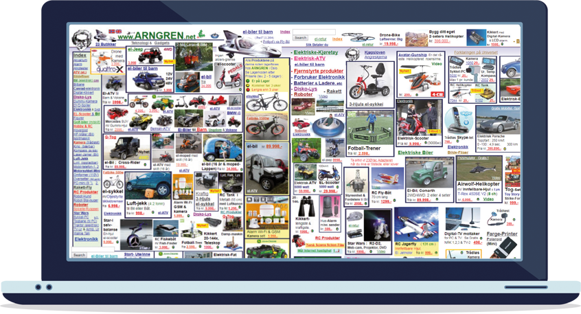
In order to create an effective design, you need to find the optimal ratio between these indicators. Removing unnecessary or highlighting important elements will help you to correctly place the emphasis and communicate the necessary information.
A minimalistic design will maximize your signal-to-noise ratio. But is it always appropriate? You will often make the appearance of your site less attractive by removing secondary elements. Therefore, a little "background noise" does not hurt. The main point to remember is that it should not block the signal. Minimalism is good, but sometimes simplicity is enough!
7. Effective Communication + Correct Copyrighting
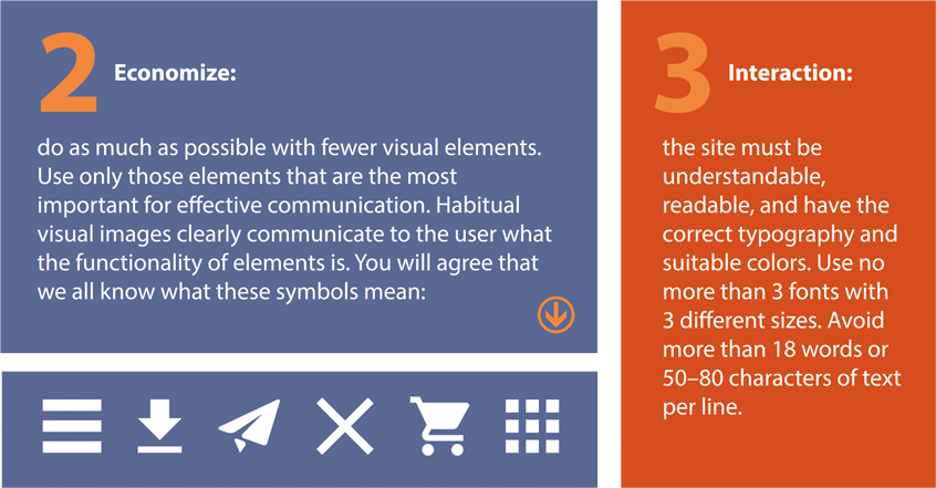
Aaron Markus, the founder and president of AM+A, one of the world’s leading experts in the field of design and usability, identifies three fundamental principles governing the use of "visual language" content in his works on how to effectively present visual information:
8. "Miller’s Purse"
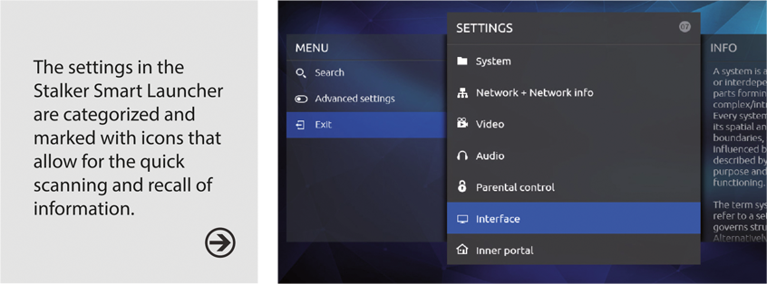
It is well known that the abilities of the human brain are not unlimited. In 1956, American psychologist George Miller determined that short-term memory, as a rule, cannot store more than seven pieces of information (+/- two). This is the so-called "purse" of items that are available for mental recall.
We do not perceive the full meaning of elements, but only their general outward characteristics. In other words, what is contained in the "purse" is not that important. What is important is that it cannot hold more than seven items. If the number of pieces of information increases, then our memory splits the information into subgroups consisting of five to nine elements. This provides some takeaways that are directly relevant to web designers. For example, do not create a menu that is too big. If you need to create a menu with many items, use categories. Group similar pieces of information together: this rule can also be classified under Hick’s Law, which we mentioned above.
9. Theory of Proximity
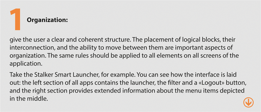
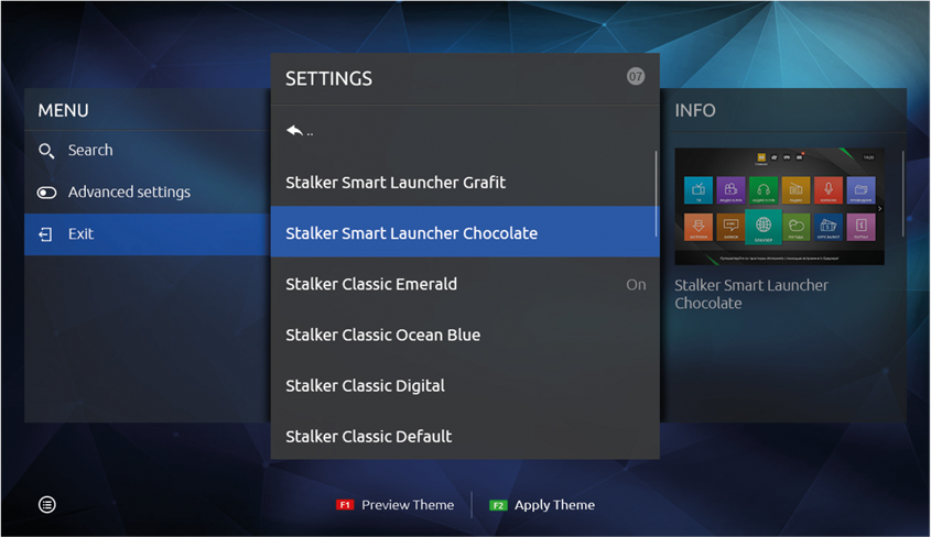
Grouping together components that are semantically related is a simple way to make it easier for customers to use a resource. Many of us are familiar with the "Open" and "Save" functions (that are like a fork and knife), and they are grouped together in one place. Similar functions are located nearby. They follow a certain logic while reducing the time needed to comprehend what they are.
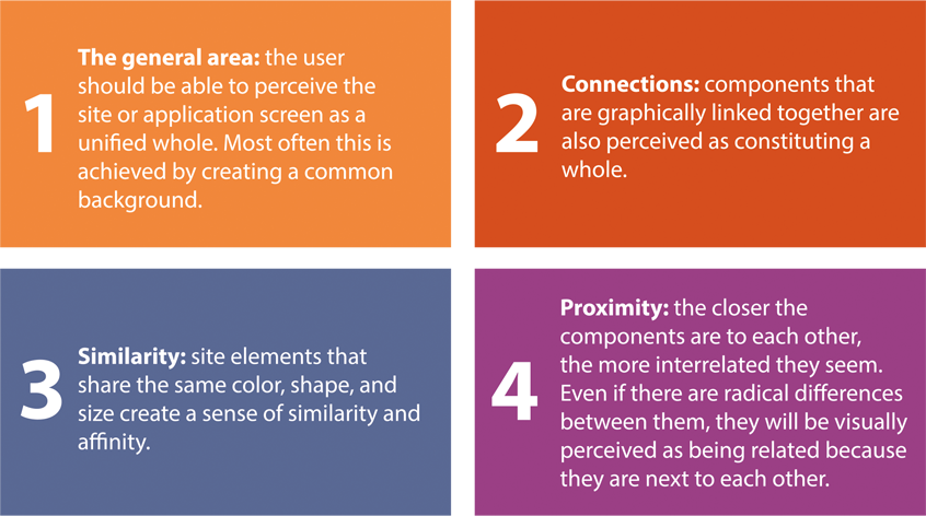
Four principles should be considered when grouping elements on a page:
10. Principle of Bridge Railings
Another word for this principle is "foolproofing". This is a very simple rule that is often overlooked: protect the user from actions that he cannot or should not do. For example, if the picture is not clickable, it should not be highlighted as an active element when the user hovers their cursor over it.

11. Principle of Intelligent Borrowing
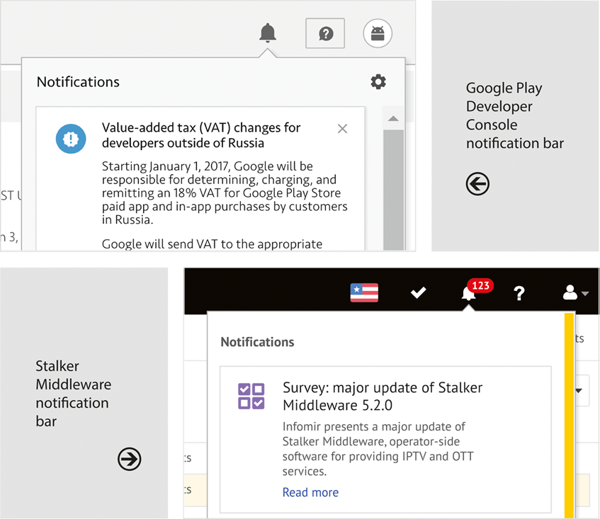
There is no point in reinventing the wheel. If a ready-made solution is suitable, it can be borrowed and adapted to your roduct. The borrowing of successful ideas from the creators of similar programs reduces user learning time and makes them more comfortable using our product. That’s because they can use the skills that they have already acquired when working with your application.
12. Trends or Verified Solutions
Some trends are started to address a special need (for example, the hamburger menu) or in response to changes in the industry (background videos). Be ready to adapt to anything. This is great advice, especially in web design, where new trends are constantly emerging.
There is nothing wrong about following these trends. However, when it comes to new «features», it is worthwhile considering how copying them into your app will affect usability. Do not get too carried away and blindly follow the fashion without looking at the needs of your audience first. In the end, your product must satisfy your user base. It was for their benefit that you created your product. Invent something new only if you are sure that this idea is really good. Otherwise, it is better to use a traditional solution.
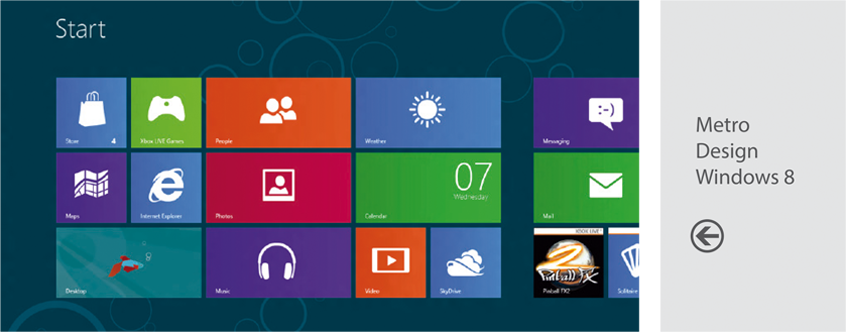
Design should be fresh and new while remaining familiar to the user at the same time. If the user is already accustomed to something, he will quickly learn new items and will get more pleasure from working with your program or site.
Follow the expectations of users and you will easily gain their trust!
Recommended

What to Consider When Scaling an IPTV Service to New Regions
Scaling an IPTV service to new regions is not just about content delivery optimization, but a task that requires a careful approach and deep analysis of several factors.

How to Choose the Best IPTV Content Aggregator
The interactive television market continues to grow dynamically, and, along with the technical base, functional IPTV platform and high-quality analytics, one of the key factors for the operator’s success is the correct selection of content.

Launching an IPTV Service in a Small City: Key Challenges and Solutions
Launching IPTV in a small community is often seen as a challenging but potentially very lucrative project.


